
A memorable logo can make a business recognizable. But a logo alone cannot tell a designer how a website should look, which typography belongs on a package, or how a company should present itself across different channels.
That's the job of brand identity design.
Brand identity design is the process of creating a coordinated system of visual and verbal elements that communicates what an organization stands for. It brings together logos, colours, typography, imagery, graphic elements and guidelines, all shaped by a clear understanding of the brand and its audience.
For graphic designers, the challenge isn't simply to make these elements look appealing. It's to understand why particular choices are appropriate, how they work together, and whether other people can apply the system consistently.
This guide explains how to build a brand identity, from the initial client brief and research to concept development, testing, presentation and final delivery.
What Is Brand Identity Design?
Brand identity design turns an organization's strategy and positioning into recognizable design elements and communication rules.
A brand identity commonly includes a logo, colour palette, typography, imagery, supporting graphic elements and a consistent approach to messaging. Together, these components help a business present itself across websites, products, packaging, social media, advertising and other touchpoints.
Brand identity, visual identity and branding are closely related, but they describe different things.
| Term | What it means |
|---|---|
| Brand identity | The recognizable system of visual, verbal and other designed elements that represents the brand |
| Visual identity | The visual components, including logos, colours, typography, images and layouts |
| Branding | The broader activities used to shape how people understand and experience a brand |
| Brand image | How audiences actually perceive the brand |
| Logo | One identifying element within the wider visual identity |
These distinctions matter when establishing the scope of a project.
A client asking for a new logo may need a symbol or wordmark. A client launching a business across several channels may need a complete identity system with rules and reusable assets.
Understanding the difference helps the designer define the work before production begins.
What Are the Essential Elements of a Brand Identity?
A coherent identity is built from components that serve different communication purposes.
Logo and logo variations
A logo identifies the brand through a wordmark, symbol, or combination of the two.
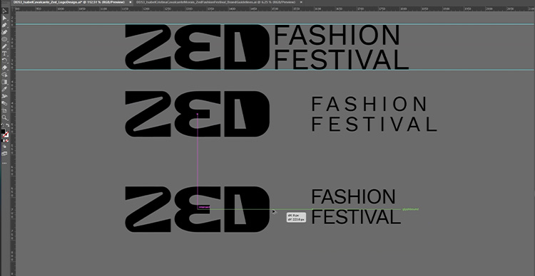
Depending on its use, the identity may require horizontal and stacked arrangements, a simplified icon, and versions suited to light or dark backgrounds.
A useful logo must be tested in context. A design that looks impressive on a presentation slide may become difficult to recognize as a small social media avatar or app icon.
Colour palette
A palette establishes a recognizable colour system for primary, secondary and supporting applications.
Instead of choosing colours solely because they are fashionable or supposedly trigger a universal emotional response, designers should consider the brand's positioning, audience, cultural context and practical requirements.
An identity may also need clearly defined text and background combinations to maintain legibility.
Typography
Typography determines how written communication appears, from headlines to small interface labels.
A brand might use an expressive display typeface for major messages and a more restrained typeface for longer text.
The important decision is how the typography supports the intended identity while remaining readable across its expected applications.
Imagery and graphic language
Photography, illustration, iconography, patterns and layout conventions help extend the identity beyond the logo.
For example, a brand may use documentary-style photography to emphasize real people and environments, or a distinctive illustration style to create a more expressive visual language.
These choices should form a coordinated system rather than a collection of unrelated assets.
Brand voice and messaging
Visual elements are only part of the identity.
The brand also needs a consistent way of communicating. Word choice, tone, messaging and content structure should complement its positioning.
A playful visual identity paired with unnecessarily formal language may create an inconsistent experience.
Application and usage guidelines
Guidelines define how the identity should be applied.
They might cover logo placement, spacing, minimum size, colour specifications, typography hierarchy, imagery choices, layouts and examples of incorrect use.
These rules make the work usable beyond the original designer.
How to Design a Brand Identity Step by Step
Brand identity projects vary in scale, but the process generally moves from understanding the problem to making design decisions and testing how well they work.
Step 1: Understand the client brief
Before designing anything, establish what the organization needs to communicate.
A useful brief should answer:
- What does the organization offer?
- Who is its intended audience?
- What distinguishes it from competitors or alternatives?
- What impression is it trying to create?
- Where will the identity be used?
- Which existing assets, preferences or restrictions must be considered?
- Who will approve the design, and on what basis?
It also helps to identify what success would look like.
A new organization might need a complete visual foundation. An established business might need to correct inconsistencies or accommodate new products without losing familiar elements.
Those are different design problems and may require different solutions.
Practical exercise: Write a short problem statement before beginning visual exploration.
For example:
The organization needs an identity that helps customers distinguish its products, works across physical packaging and mobile screens, and can be used consistently by a small marketing team.
This is more useful than an instruction to make the brand look modern.
Step 2: Research the audience and competitors
Research helps establish which design choices are relevant and which are based only on personal taste.
Begin with the intended audience. Consider its needs, expectations, contexts of use and likely points of contact with the brand.
Then examine competing or comparable identities.
Look for patterns in their logos, colours, typography, imagery, messaging and applications. Identify conventions that serve a practical purpose, as well as opportunities for the new identity to establish a distinctive direction.
Competitor research is not an invitation to imitate an established brand. It helps designers understand the visual landscape in which their work will appear.
What to produce: A concise research summary showing audience insights, category patterns, constraints and possible design opportunities.
Step 3: Define the creative direction
Research becomes useful when it guides decisions.
A creative direction translates the brief into a set of principles that the designer can apply while developing the identity.
For example, the direction might prioritize clarity, accessibility and warmth. Another project might emphasize precision, restraint and technical sophistication.
These qualities are not designs in themselves. The designer still needs to decide how typography, colour, composition, imagery and language will express them.
A mood board can help establish possible visual approaches, but it should be accompanied by an explanation of what the references are intended to communicate.
Before moving forward, ask: Can the direction be justified using the brief and research, or is it primarily a personal aesthetic preference?
Step 4: Develop and evaluate visual concepts
Start exploring combinations of typography, marks, colours and supporting graphic elements.
Early concepts don't need complete brand guidelines. They need enough detail to communicate a distinct direction.
For each concept, explain:
- What idea connects the visual elements?
- How does it reflect the brief?
- What makes it appropriate for the audience?
- How does it differ from relevant competitors?
- What limitations might appear in real applications?
This creates a basis for comparison.
Rather than presenting concepts as unrelated stylistic alternatives, evaluate each against the agreed design criteria.
A concept may look attractive but fail to work on product packaging. Another may communicate the right personality but offer poor legibility at smaller sizes.
The strongest choice is the one that best meets the project's requirements—not necessarily the one that looks most impressive in isolation.
Step 5: Build the complete visual identity system
Once a direction is selected, develop the elements needed to apply it consistently.
This may include a primary logo, alternative arrangements, colour palette, typography hierarchy, image treatments, iconography, patterns and reusable layout rules.
Each element should relate to the wider system.
For instance, if the typography emphasizes distinctive geometric forms, the same visual language might influence icons or supporting shapes.
However, consistency does not require every element to look identical. A flexible system allows different applications to serve their purpose while remaining recognizable.
Step 6: Test the identity in real applications
A polished presentation does not prove that an identity will work in use.
Test the system in the environments where the brand will actually appear.
For a consumer product, that might include packaging, signage, advertising and online storefronts. For a digital service, it could include mobile screens, websites, email and social media.
Review the design against practical questions:
| Test | What to check |
|---|---|
| Small-size logo test | Is the mark recognizable and legible? |
| Single-colour test | Does the design work without its full palette? |
| Typography test | Can people read the content at realistic sizes? |
| Accessibility test | Do essential text and interface elements have sufficient contrast and clarity? |
| Cross-channel test | Does the identity remain coherent across different formats? |
| Production test | Can the intended files and colours be reproduced correctly? |
| Usability test | Can someone unfamiliar with the identity apply the rules? |
Testing may reveal that a logo needs a simplified variation, a colour combination lacks adequate contrast, or a graphic treatment is too complex for everyday use.
These are not necessarily failures. They provide information that can improve the system before delivery.
Step 7: Present the design and explain the reasoning
A client presentation should connect the final design to the problem established in the brief.
Begin with the original objective and the relevant research findings.
Then explain the chosen creative direction, visual system and examples of how the identity works in practice.
Avoid relying solely on claims that the design looks professional, modern or memorable.
Show how the visual decisions address particular communication needs.
If the client requests changes, establish whether the concern involves the original brief, a practical limitation, or an aesthetic preference.
This helps the designer respond thoughtfully instead of making unrelated revisions.
Step 8: Prepare the brand guidelines and final handoff
A finished identity needs to be usable by people who did not participate in its creation.
Prepare files in appropriate formats and organize them clearly. The exact package depends on the project's scope.
A brand identity handoff may include:
- Approved logo variations and production files
- Colour specifications for relevant media
- Typography definitions and licensing information
- Imagery and illustration guidelines
- Layout and spacing rules
- Sample templates or applications
- Examples of incorrect usage
- A concise brand guidelines document
- Notes explaining which files should be used in different situations
The handoff should make common decisions straightforward.
For example, someone preparing a social media graphic should know which logo variation, typography, colours and templates to use without having to contact the original designer each time.
 There’s limitless potential to what VFS students can create with industry-standard Adobe Photoshop.
Brand Identity Design Example: From Brief to Finished System
Consider a hypothetical identity project for a neighbourhood cultural venue.
The venue hosts live music, exhibitions and community events. Its current promotional materials use different fonts, colours and visual styles, making it difficult to establish a recognizable presence.
The design challenge
The new identity needs to represent several types of programming without appearing to be a different organization for each event.
It must work across posters, tickets, social media, signage and a mobile-friendly website.
The creative direction
After studying the venue's audience, surrounding cultural organizations and existing communications, a designer might propose a flexible typographic system.
The concept could use one recognizable wordmark, a consistent grid, and a limited set of colours that can be combined in different ways for different event categories.
The design decisions
Instead of assigning a different logo to each event, the designer uses a common logo and layout system.
The typography provides continuity, while imagery and selected accents allow individual events to have their own character.
Testing the system
The designer produces realistic examples: a printed poster, mobile event listing, social media announcement and venue sign.
These applications reveal whether the system can accommodate very different content without becoming inconsistent or difficult to use.
The final deliverable
The project concludes with reusable templates, logo files, colour specifications, type rules and brand guidelines.
This is an illustrative scenario, not a documented VFS student project.
Common Brand Identity Design Mistakes
Starting with the logo before understanding the brief
A logo may be visually appealing while doing little to solve the organization's actual communication problem.
Research and positioning should establish the criteria against which the design will be evaluated.
Treating colour psychology as a fixed rule
Colour associations can vary by audience, culture, context and the way colours are combined.
A particular colour does not guarantee that a brand will be perceived as trustworthy, exciting or sophisticated.
Test the palette against the intended audience and actual applications rather than relying on universal interpretations.
Designing only for presentation mockups
A convincing mockup can hide practical problems with typography, scaling, contrast and production.
Use real-size applications and test how the identity functions beyond a presentation.
Creating too many unrelated elements
Additional fonts, colours and patterns can make an identity more difficult to manage without improving it.
Each element should have a defined purpose within the system.
Leaving guidelines until the end
If the identity is difficult to explain or reproduce, it may not be sufficiently developed as a system.
Document rules during production and confirm that people who will use the identity can understand them.
Brand Identity Design Checklist
Before presenting or delivering an identity, check whether the work answers the following questions.
Strategy and direction
- Is the intended audience defined?
- Is the design problem clear?
- Is there a documented creative direction?
- Can important design choices be connected to the brief?
Visual system
- Are the logo variations appropriate for their intended uses?
- Do colours and typography work together?
- Are imagery and supporting graphics consistent?
- Does the identity work across the required formats?
- Have legibility and accessibility been checked?
Delivery
- Are final assets clearly named and organized?
- Are the brand guidelines practical and understandable?
- Are templates and production specifications included where required?
- Can someone else use the system without repeatedly asking the designer for clarification?
If any answers are missing, the next step is to resolve that weakness rather than simply add more decorative elements.
Learning Brand Identity Design at Vancouver Film School
Brand identity design brings together research, visual communication, creative direction, technical production and the ability to present ideas.
Vancouver Film School's Digital Design diploma program includes branding and identity development within its broader training in interactive design and motion graphics.
Students study areas such as brand strategy, logo design, visual systems, typography, communication design, creative direction and client presentation.
The program also includes team-based client work, allowing students to develop design concepts in response to real briefs and production requirements.
Through the development of a portfolio, students can document not only final visual outcomes but also the research, decisions, prototypes and revisions behind them.
For aspiring designers, this distinction matters. A brand identity case study is more informative when it demonstrates how the design responds to a problem, not only how the finished assets look.
Explore the Digital Design program at Vancouver Film School to learn more about the curriculum, specializations and student portfolio work.
FAQs
Is brand identity design the same as logo design?
No. Logo design focuses on creating an identifying mark or wordmark. Brand identity design covers the broader visual and verbal system, including typography, colours, imagery, applications and usage guidelines.
What software is used for brand identity design?
Tools such as Adobe Illustrator, Photoshop, InDesign and Figma can support different parts of the process. The choice depends on whether the task involves vector artwork, image editing, layout, digital prototypes or collaborative production.
What should a beginner include in a brand identity project?
A beginner project can include a brief, audience and competitor research, creative direction, logo concepts, typography, colours, several realistic applications and concise guidelines. Documenting the decisions behind the work is as important as showing the final assets.
What is the difference between brand identity and visual identity?
Visual identity refers primarily to the design elements people see. Brand identity is broader and can include messaging, voice and other designed expressions of the brand.
How do you know whether a brand identity works?
Evaluate it against the brief and intended use. Test recognizability, legibility, accessibility, consistency and whether other people can apply the system. Audience feedback can help, but individual opinions should be interpreted in context rather than treated as proof of universal preference.
Do you need to study graphic design to create brand identities?
A formal qualification is not universally required. Brand identity designers do, however, need practical skills in research, typography, composition, visual communication, design software and presenting their decisions. Structured training and project experience are possible ways to develop those skills.